Swimwear Colour Development: From Pantone to Production Fabric
Colour is one of the most visible decisions a swimwear brand makes. It shapes how a collection looks in stores, in photos, and connects customers to the brand season after season. But translating a colour idea into consistent production fabric is a multi-stage process, often new to brand owners preparing their first collection. This guide explains the stages of choose swimwear Color Development—from Pantone reference to approved bulk fabric—and what brands should prepare before starting.

Why Colour Development Is More Complex Than Choosing a Pantone Code
Choosing a Pantone number is straightforward. Pantone is the most widely used colour referencing system in fashion and manufacturing, providing brands and manufacturers a shared language for colour communication. If a brand specifies “Pantone 15-1520 TPX,” a soft peach tone, any manufacturer worldwide has a consistent reference.
The complexity comes in translation. A Pantone chip is printed on paper; swimwear fabric is a knitted synthetic. Applying the same colour reference to two very different materials will not yield identical results. The fabric’s surface, its light reflection and absorption, and fibre content all affect how the colour appears. This is not a quality issue; it is a physical reality of working with fabric, which is why colour development requires a review and approval process rather than a single decision.
Treating a Pantone code as final output rather than a reference often leads to surprises during sampling. Understanding the process early helps prevent production delays.
How Pantone Colours Are Used in Swimwear Development
When a brand submits a colour direction to a manufacturer, the Pantone reference is passed to the fabric supplier as the target. The supplier uses this to produce colour samples in the specified fabric, typically the same fabric construction that will be used in production for the brand to review.
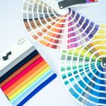
Pantone offers several systems, but for swimwear, the Pantone Fashion, Home + Interiors (FHI) range—especially TPG or TCX chip cards—is correct. These represent fabric colour, not paper colour. Using graphic design references (coated C or uncoated U) is paper-based and doesn’t translate to fabric, creating a gap between expectations and reality.
Brands can also submit physical swatches—a piece of fabric, a garment, or another product—for colour reference. These are often more useful than codes alone, as they show tone, depth, and finish.
| Practical tip:
If you are referencing a color from an existing garment or fabric you love, bring or send that physical piece as a reference alongside the closest Pantone FHI match. Physical references give the supplier more information to work with than a code alone. |
Why Colors Look Different on Fabric Than on Screen or Paper
There are three situations where colour perception commonly misleads brand owners during development: viewing on screens, reviewing printed references, and evaluating samples under the wrong light.
Screens use RGB to display colour; fabric reflects ambient light. A coral colour may look warm and saturated on a phone but appear muted or pink on fabric. This common confusion makes colour review by photo or screen unreliable in early development.
Lighting greatly affects colour perception. A sample under warm indoor light looks different from under cool daylight. This is metamerism: colours can match in one light but differ in another. Brands should review samples under consistent daylight or a standardised daylight lightbox.
Paper-based Pantone references, even physical books, behave differently from fabric. FHI chip cards are better for fabric, but their uniform surface doesn’t match the fabric’s texture or absorption. A perfect Pantone match may still look lighter, darker, or a different saturation on fabric—this is expected.
| Review rule:
Always evaluate color samples in natural daylight or under a standardised daylight lightbox. Warm indoor lighting misrepresents color and is one of the most common reasons for avoidable approval disputes. |

Choose Colour from a Swatch Book (Ready Colours from the Manufacturer)
For new swimwear collections, choosing colours from the manufacturer’s swatch book is practical and production-friendly. Swatch books showcase fabrics already stocked or regularly produced, so they’re available quickly, with no minimum order, for your brand.
This approach removes much of the colour development timeline from the equation. Because the colour has already been tested on a fabric, no multiple rounds of sampling and approval are required before bulk production can begin. The colour you see on the physical swatch is the colour you will receive, which makes planning easier, faster, and more predictable, especially for a first order where timelines are often tight.
If you choose a custom Pantone colour not stocked by the supplier, the fabric must be specially dyed—usually with a minimum order quantity (MOQ) set by the manufacturer. This MOQ is for
fabric yardage, not finished garments. For small brands, it can mean buying more fabric than needed for the first run. Custom colours also cost more and take longer. Starting with a ready swatch book of colours provides a proven palette that keeps your collection efficient.
How Colour Approvals Work During Swimwear Sampling
Colour approval is a formal step in the sampling process. It’s not just liking the colour; it’s a documented sign-off that tells the manufacturer: this is the standard accepted for production.
The process: the manufacturer or supplier produces colour samples in the target fabric. These samples—physical, not photos—are sent to the brand. The brand reviews them under correct lighting and responds: approved, approved with comments, or rejected with revision direction.
If approved, the brand signs off in writing. This sample becomes the reference for bulk production. Colour claims later are checked against this sample, not the original Pantone code. If revised, feedback goes to the supplier for a new sample.
Most approvals need one to three sample rounds. The number depends on colour complexity, how precise the original brief was, and the clarity of feedback.
| Important process note:
Color approval must be a written confirmation not a verbal agreement or a thumbs-up message. The approved physical sample is retained by both the manufacturer and the brand as the production reference. Without a documented approval, disputes about color in bulk have no clear reference point. |
From Approved Sample to Production Fabric
Once a colour sample is formally approved, the manufacturer communicates the approved standard to the fabric production team. The bulk fabric is then produced to match the approved sample as closely as possible.
Bulk production introduces new variables: industrial scale, machine differences, and environmental factors. Bulk fabric will rarely match the sample exactly, but a managed process keeps variation within an acceptable, invisible range.
Before approving bulk fabric for cutting, it is checked against the approved sample. If variation is within tolerance, production proceeds; if not, the fabric is flagged. This bulk colour review helps protect brands from noticeable differences in the finished fabric.
At this stage, a well-prepared tech pack is critical. It should clearly reference the approved colour standard, the material, and state that final approval is by physical sample. This gives production clear, direct instructions.
Common Colour Planning Mistakes Swimwear Brands Make
These are the most frequent colour-related problems we encounter when working with new brands preparing their first collection:
- Reviewing samples on screen results in approvals without seeing the physical sample. Screens show colour in RGB, which differs from real fabric conditions.
- Using the wrong Pantone reference system. Specifying Pantone codes from the graphic design system (coated C or uncoated U) instead of the FHI textile range. The same Pantone number in different systems refers to different colours. The graphic codes are calibrated for printing, not fabric.
- Developing too many colourways for the first collection. Requesting six or eight custom colours on a first production run significantly extends the timeline and increases development costs. Two to four colours are a more manageable starting point for a debut collection.
- Not providing written approval. Verbally confirming a colour over a call or with an informal message, without a documented sign-off. Without written approval referencing a specific physical sample, there is no clear standard for bulk production to be measured against.
- Giving vague revision feedback. Responding to a sample that is not quite right with comments like “it looks a bit off” or “needs to be brighter.” Actionable feedback should specify the direction of the change and, ideally, reference a closer Pantone code to guide the revision.
- Not accounting for colour development time in the production timeline. Planning a bulk production start date without factoring in the two to three weeks that colour approval typically adds before fabric can be cut. This compresses the sampling stage and creates pressure across the rest of the schedule.

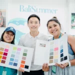
How Bali Summer Manages Colour Development with Clients
Our colour development process begins at the briefing stage. When a brand comes to us with a collection concept, one of the first practical steps is to establish the colour palette: how many colours, which Pantone FHI references or physical swatches are being targeted, and which fabric construction they will be applied to.
We brief our fabric suppliers with the full colour direction and request physical samples for the brand to review. We do not approve colours via photographs; all reviews are done on physical samples, and we guide brands on how to evaluate them correctly, including lighting conditions and what to look for when comparing a sample to the reference.
For brands that are new to colour development, we also help structure their revision feedback so it is actionable for the supplier. Vague comments slow the process down; specific, directional feedback keeps revision rounds to a minimum. This is part of the broader support we offer brands preparing their first collection, guiding the process rather than simply executing instructions.
Once a colour is approved, we retain the approved sample in our records, along with the brand’s sign-off documentation. This gives both parties a clear reference point for bulk review and for any future reorders.
Final Thoughts on Swimwear Colour Development
Colour development is one of the earliest and most consequential decisions in a swimwear collection. The brands that manage it well treat it as a process with defined inputs, clear approvals, and realistic timelines, rather than a quick decision made at the start of a brief.
A well-managed colour development process protects the brand from receiving bulk fabric that does not match its vision. It gives the manufacturer a clear standard to work to. And it creates a documented record that makes reorders and consistency across seasons much easier to achieve.
If your brand is preparing its first collection and you are unsure how to structure your colour brief or how many colourways are realistic for your budget and timeline, the most productive starting point is a conversation with your manufacturer before making any other decisions. For brands also working through technical decisions like size chart development and sampling timelines, colour development fits into the same pre-production planning window and coordinating all three from the start creates the most efficient path to bulk production.
LET’S CREATE!